Pages

Monday 14 January 2013

Evaluation


                                                                                                            Jessica Derges
Evaluation                                                                       Digital Media Foundations

Our project ‘Happy Feet’ was developed and created over a period of eight weeks. It combines the use of sound and visual techniques to portray the development of dance, music, fashion and film over a time span of eighty years.

When set the task of coming up with an original idea for the project, there were many concepts we had in mind, however most of these were unsuitable and difficult to produce, due to limited availability for space and actors. We decided to go with our idea of Happy Feet after much consideration about time span, space and unavailability of an actor. We also chose it because it was challenging yet within our reach to produce.

We wanted to achieve a linear narrative structure throughout the project, so we used techniques such as Mise-en-Scene to provide a link to our through the ages narrative.
The costumes we chose were shoes and this proved to be more difficult because there needed to be a considerable amount of difference from one era to the next. However due to extensive research into costume from each era, we were able to define from one decade to the next successfully. Different styles of editing were used to create an advancement through time. Effectively, this showed the process of film and television from the period of the 1920’s through to 2000. Using Adobe Photoshop, I created a different edit for each period in time, so that this narrative element would look effective and each era was successfully defined.

The combination of visuals like the costume and the editing allowed the audience to feel like they were following the narrative and also allowed them to connect to the project. We were also able to productively allow audiences to connect to the piece through the heavy use of stereotype. The piece was structured in a narrative fashion as it showed a beginning, a middle, an end and a change.

The use of a feet-only shot ignited a mystery to the project. It enabled the viewer to raise questions relating to the project, as there was no face or familiarity within the shots. This allowed the audience to engage within the project more, therefore creating an enigmatic narrative. It followed Barthes' pattern of enigma by producing and raising questions about the film and draws the reader into following the piece.

The music was chosen to give familiarity to the audience, which would effectively entise them into the project. It also opposed the other areas of the project, by being obvious and well known. The audience would have felt familiar with a lot of the music chosen, which allowed them to engage with the project more. This is a way that our piece became interactive, as audiences could connect with the music and fashion of the film. We knew that whatever the age of the audience, there would be a section within the story that they could relate to, whether that be an era, fashion style or musical piece.

Our piece fitted well theoretically by using the linear and straightforward narrative style and the enigma code which allowed the piece to have a mysterious edge. I think it was successful in enticing and allowing the audience to interact with the piece, which was the main aim of this project.

Wednesday 9 January 2013

Update

I thought I would update the blog as I haven't for a while. I have finished my whole project for digital media foundations and created an accompanying blog (as seen here) and evaluation, which I will be posting in the next blog post.


Sunday 16 December 2012

The Proposal

This is a copy of our original group proposal:

CONCEPT
*Idea: Our idea is to produce a screen based stop motion short film, which incorperates a circus theme. In addition to this circus concept, there will be a big focus on using vintage, black and white and sepia photography to shoot this.
*Inspiration/Motivation: We have taken inspiration from a number of different sources, but focused primarily on the opening sequence of the film "The Moulin Rouge". Alongside this, we researched vintage photography using blogging sites such as Tumblr. It was these dark shots that inspired us to pick our theme.

Target Audience: Our concept is set to appeal to both teenagers and adults.

Suitability to Target Audience: No use of strong language and no sexual content.

PROJECT REQUIREMENTS
Equipment: Mac Computer, Camera, Tripod
Software: Photoshop, Flash, Premier Pro.
Location: Outdoor and indoor space
Other: Actors and production crew such as director, makeup artist and costumier among others.

PROJECT TIMELINE
*Week 6 - Researching and looking for locations
*Week 7 - Shooting and putting together background sound
*Week 8 & 9 - Selecting shots, creating backdrop images and editing
*Week 10 - Individual evaluation (no groupwork this week)
*Week 11 - Project presentation
*Week 12 - Completion of project

PROJECT DESCRIPTION
We will be producing a 1-3 minute short film, which will be constructed using stop motion animation. We wanted to give the film a dark and more thoughtful undertone so it was decided that the best way to portray this feeling wasd through using black and white or sepia, vintage style photography and filming. We all thought that giving the piece an unpolished look would give the piece an aged feel.
Alongside this, we are going to use music, rather than dialogue toset the mood within the story., and explain the different feelings throughout the film. It will also porrtray the characters and the moods that they want to convey. We want to use classical and dramatic music in addition to the visuals to make this a success.
The story will contain text pop ups which make the story more interactive. The text will have a gothic or aged feel, which will match the concept of the narrative. These bites of text will pop up during the characters performance and in between it, to give the audience some brief information about the situation occurring in the film.
We want to use a linear narrative to portray the story and wwe wanted the story to build and progress throughout the time we are given. We also wanted to make light of Todorov's equilibrium theory, where the story begins, a problem or issue occurs and then the story goes back to the way it was before.
We would also like to include Propp's character theory into the short film, by adding certain characters that are typical in his theory and the genre we want to create. These characters will be similar to the "Princess" and the "Hero" and give the story a generic narrative feel.

Wednesday 5 December 2012

Update

5th December 2012:

I have spent the last 3 days preparing some final parts to the project, including the following:

  • Preparing a power-point presentation and accompanying notes for the group to read out on Thursday 6th December.
  • Editing photos. These photos have to be edited in sections, which represent the different decades that we are focusing on (1920's to 2000's). Each photo differs in quality and editing styles to represent film and photography styles of that particular decade.
Here are some examples of the editing I have been doing for each decade:
Film grain filter and brightness/hue changes were used to create the 1930's edit.

Brightness, black and white and a slight film grain filter were used to create the 1930's edit.

Black and white with a sepia effect was used to create a 1940's edit.


Sunday 2 December 2012

Presentation

I have decided to start writing the presentation for the group assessment this week, so far I have written down about how the project came to be and the research that was involved. I am to have this finished by Tuesday 4th December due for Thursday 6th December.
Here are some screenshots of the presentation so far:


Overall there will be approximately 20 slides which will contain information from the equipment and programs used through to costume and music and screenshots of the filming.

Saturday 1 December 2012

Editing photos and images

1st December 2012:
This afternoon I have edited over 200 photos which will be in the first section of the film. I have used Adobe photoshop to edit these images and focused mainly on using black and white and filters such as film grain. Here are some examples of the editing I have done for the 1920's section of the film:


I also spent time looking at different filters for the other decades in the production, here are my ideas:

1920s

1930s

1940's

1950's


Costume & Screen shots

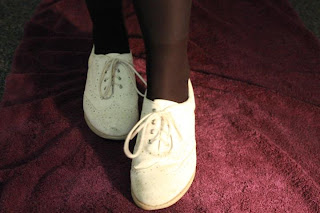
The project required us to us shoes as props/costumes. These are the stills of the shoes we used for the piece.

1920's shoes

1930's flapper girl shoes

1940's wartime shoes

1950's glamour shoes

1960's rock and roll shoes

1970's hippie shoes

1980's glam rock shoes

1990's girl band shoes
Stills from the shoot
We met on the 29th of November to shoot our production. This required using a DLSR camera, numerous costumes (above), a dancer (me) and music that we had specifically selected for the production.